LMT2
Project Details
During my time at Landing, I focused on designing features such as X, Y, and Z, which contributed to a 30% increase in user engagement and a 20% increase in revenue. By following a user-centered design process and leveraging data-driven insights, I was able to design solutions that not only improved key growth metrics but also aligned with the companys broader business goals.
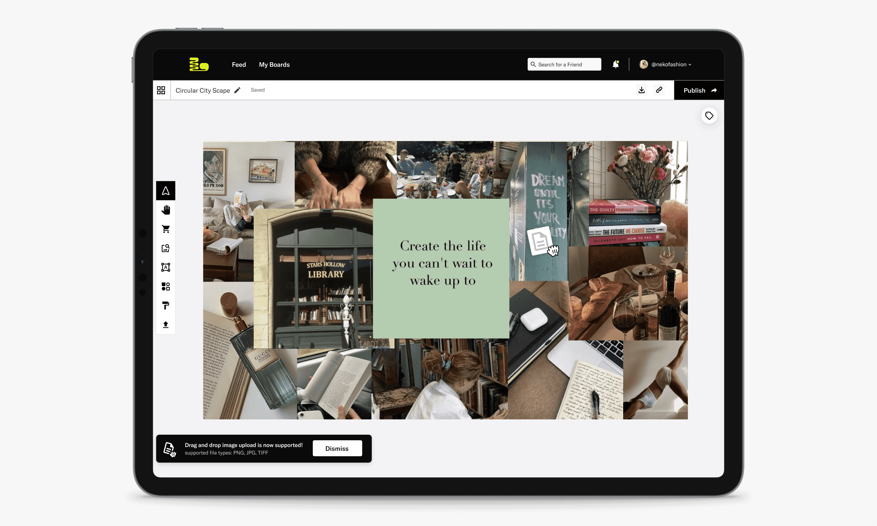
The workspace for users creating moodboards
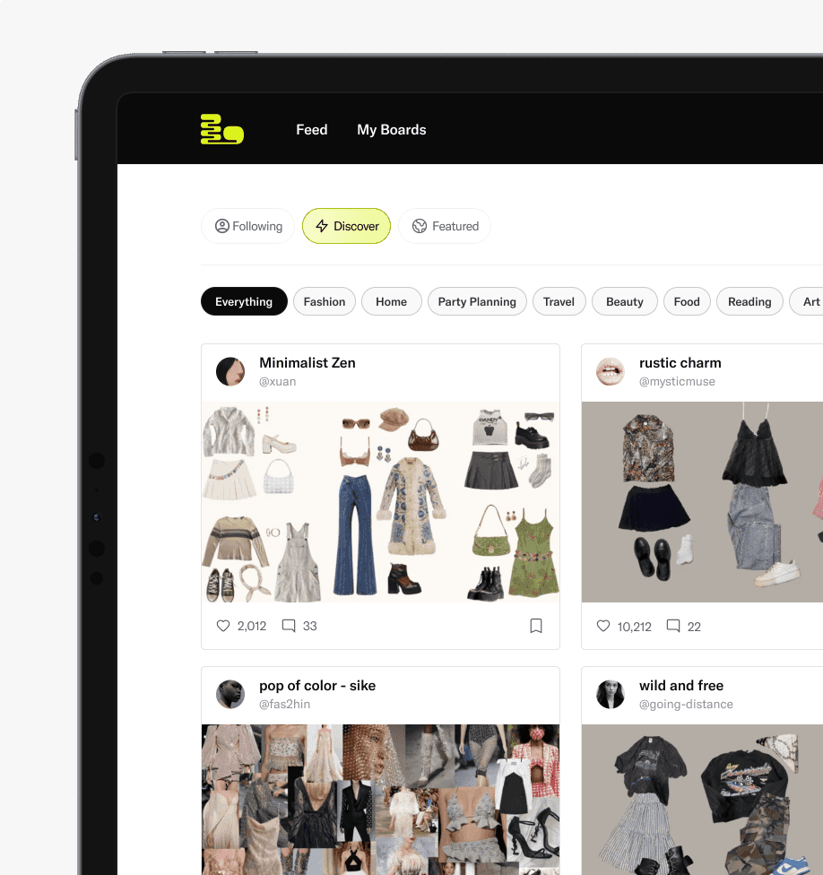
Huge amounts of variation on the feeds.
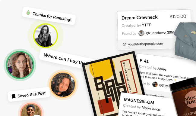
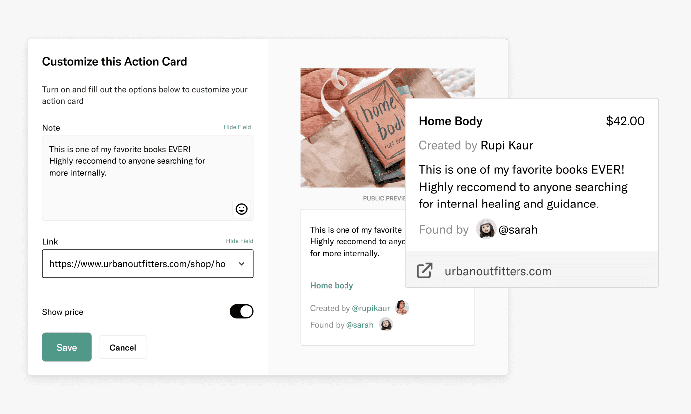
Each image has links and data tracing back to the user upload.
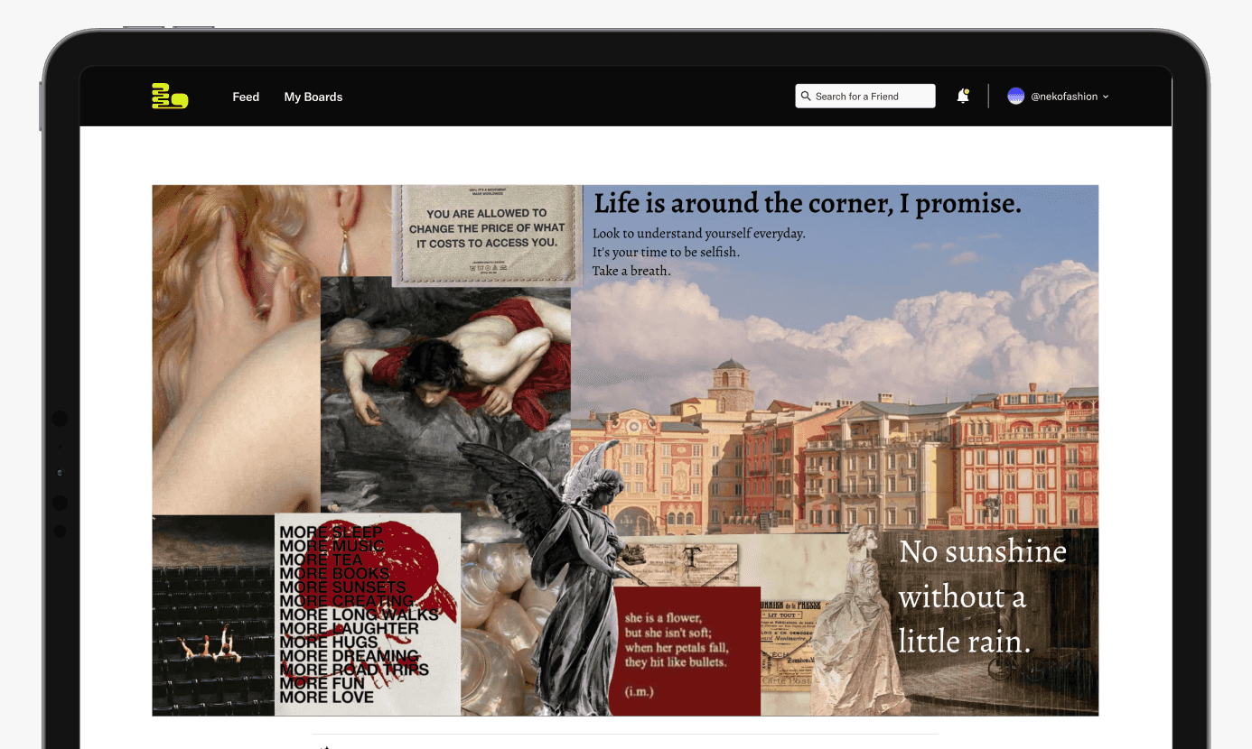
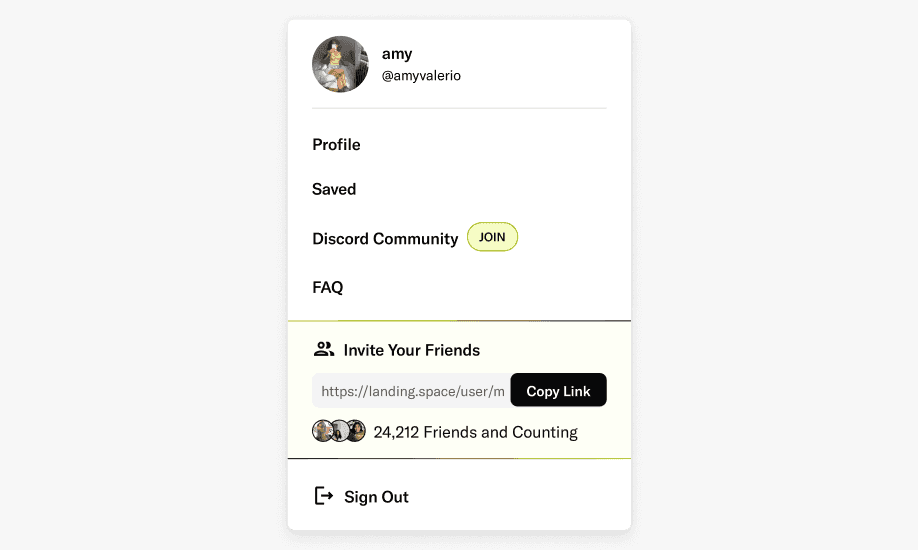
Building out small moments of delights for inviting users.
Challenge
Many consumers struggle to articulate their design preferences when decorating their homes, leading to frustration and dissatisfaction with their choices.
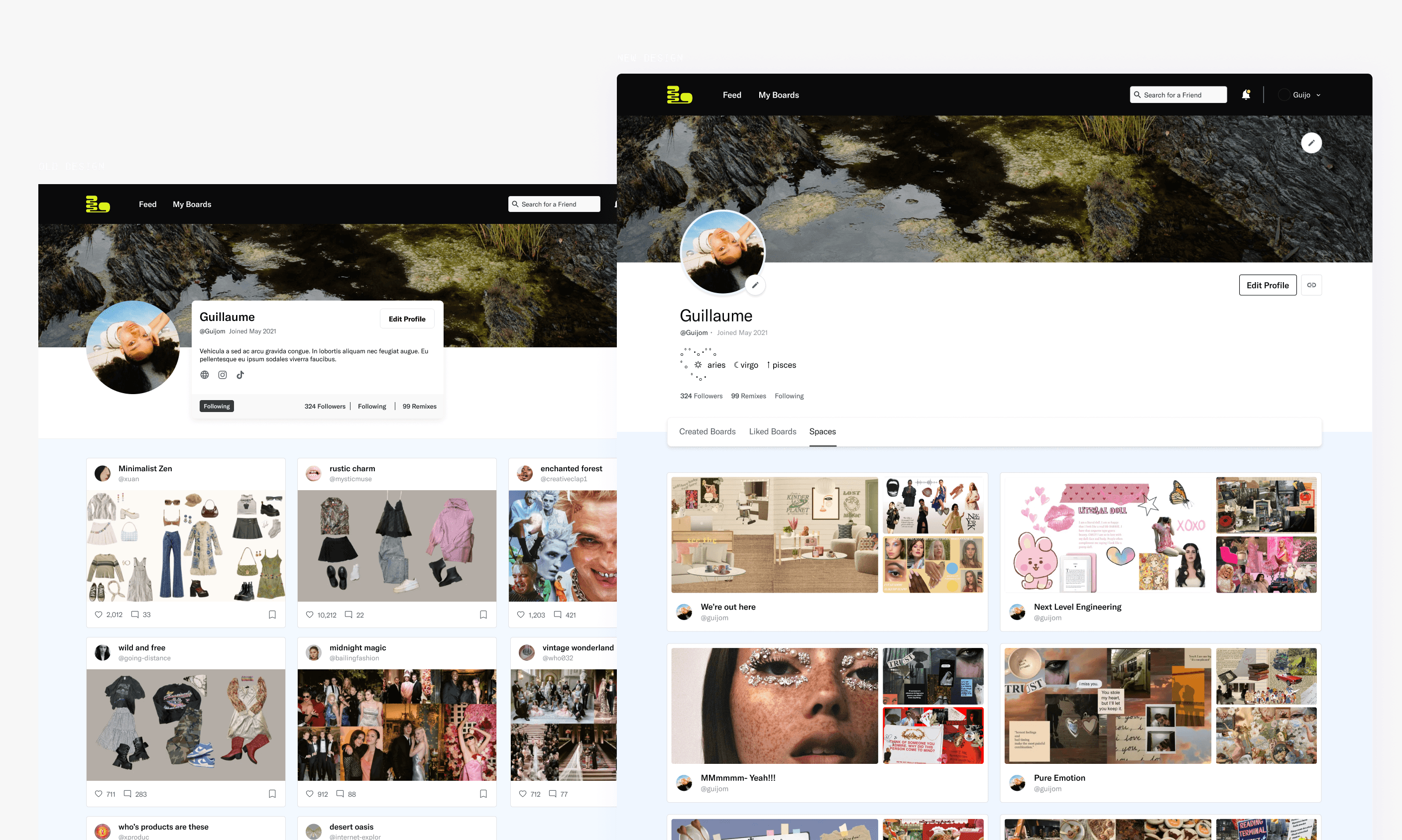
Comparing the old profile design that stifled user creativity.
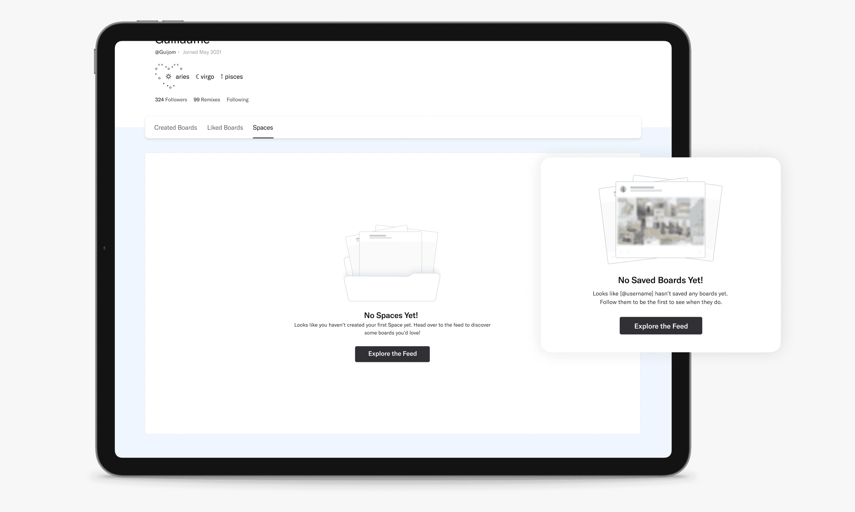
Empty states were missing in previous designs.
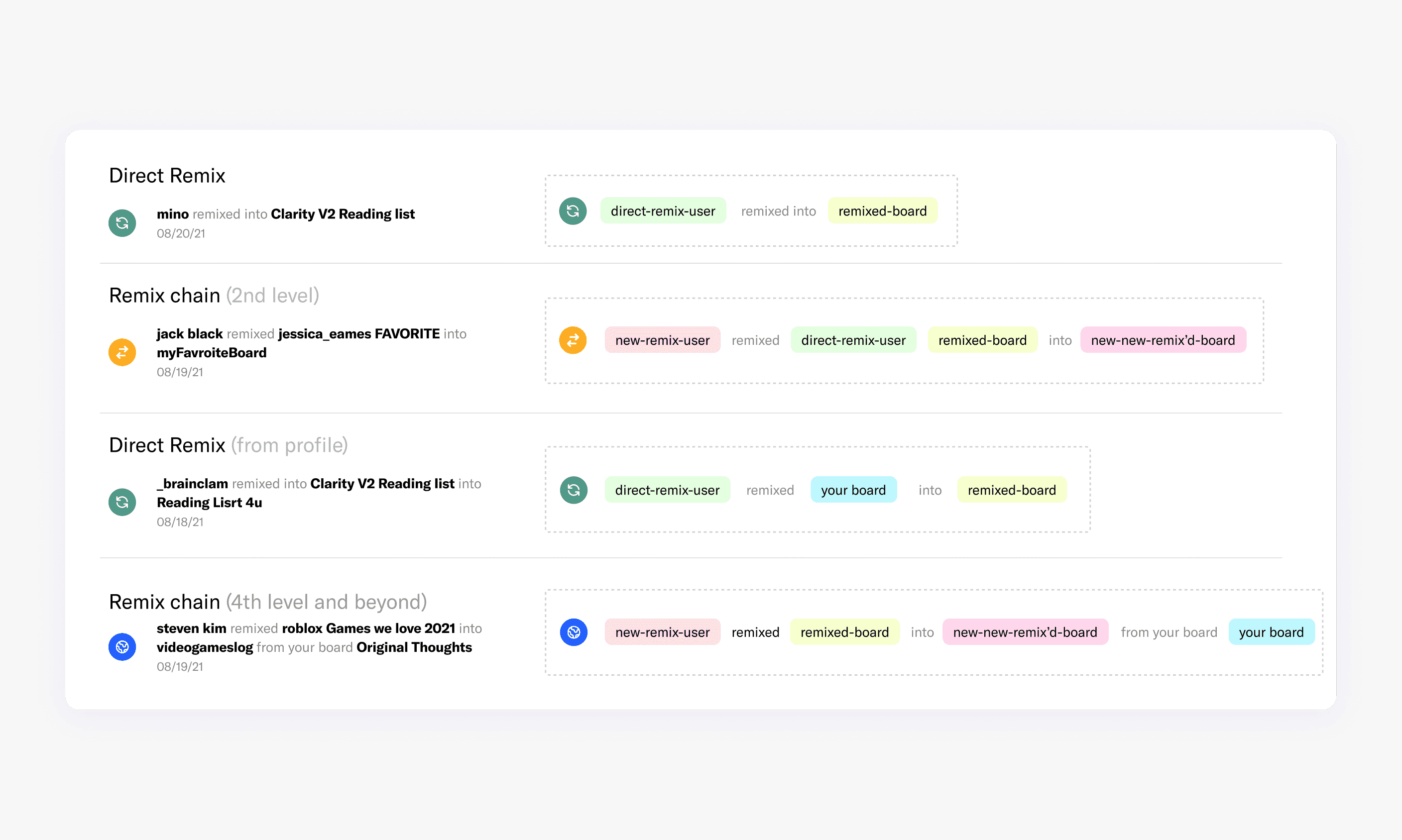
Remixing involved users using others' images for their creations, and it was crucial to ensure proper credit attribution.
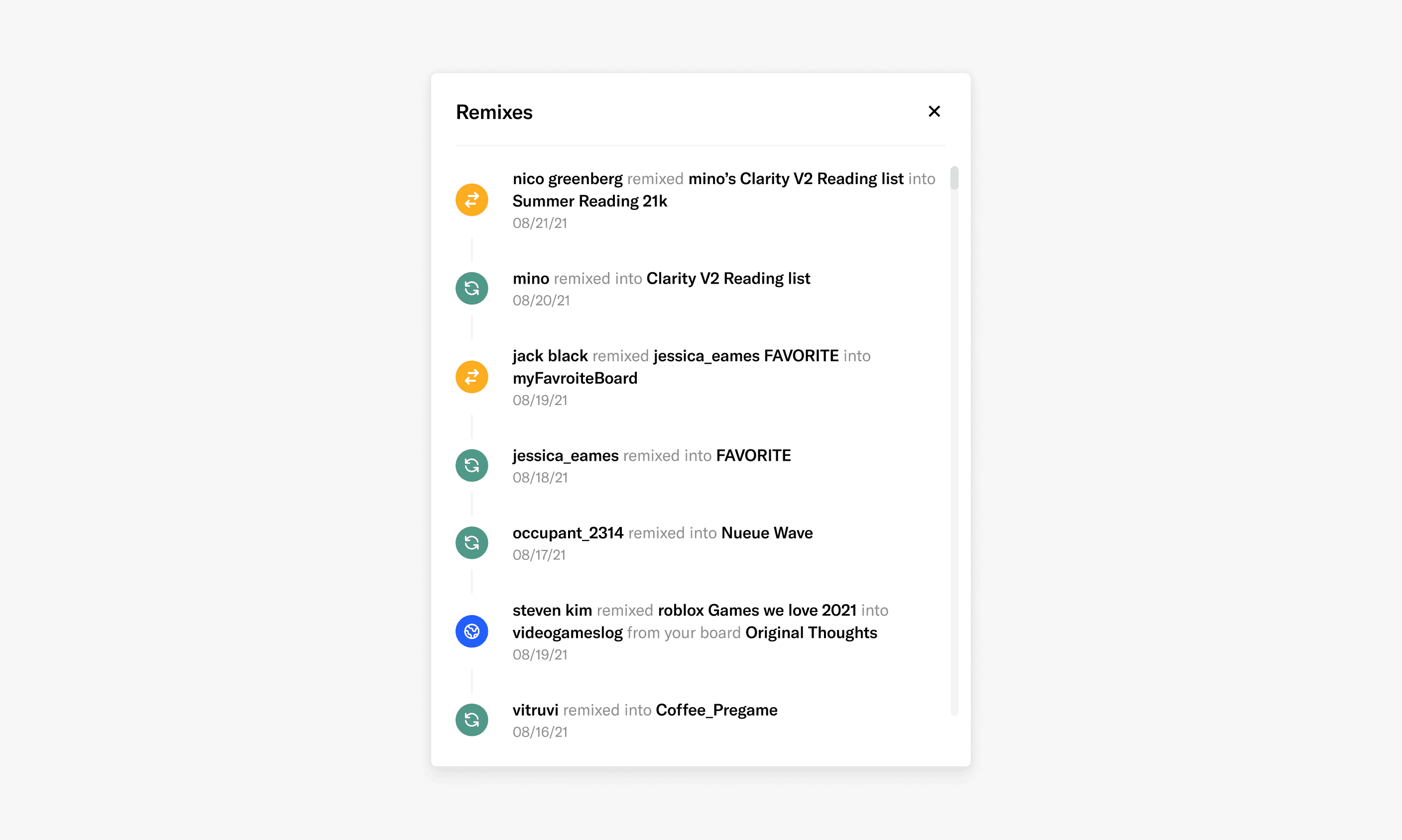
Levels of credit and my approach to scalable design.
Takeaways
My time at Landing taught me a lot, combining product design and brand building in a small startup. Looking back, Id enjoy enhancing the experience with refined micro-interactions and subtle adjustments for a more cohesive feel. Nonetheless, Im confident their current direction will lead to great success..
Highlighted projects
Mainstream destinations.
Opening hours
Monday to Friday 9AM - 6PM
